I’ve decided to critique the following data visualization, titled “Politicians’ Salary & Income Inequality”.
I chose this visualization for a few reasons. The first being that I am very interested in the political space and the power/influence politicians hold. I also feel that a country’s culture directly correlates to the politicians that hold power and how they use that. Simply put, countries that tend to have a higher quality of living, with more effective social systems tend to elect leaders that represent those values and are less mired by corruption. My thesis work at DSI is about the disconnect in the political discourse around environmental policy and the concerns everyday citizens feel about those issues. I think lifestyle discrepancy plays a big part in how out of touch politicians can be with the average person’s concerns.
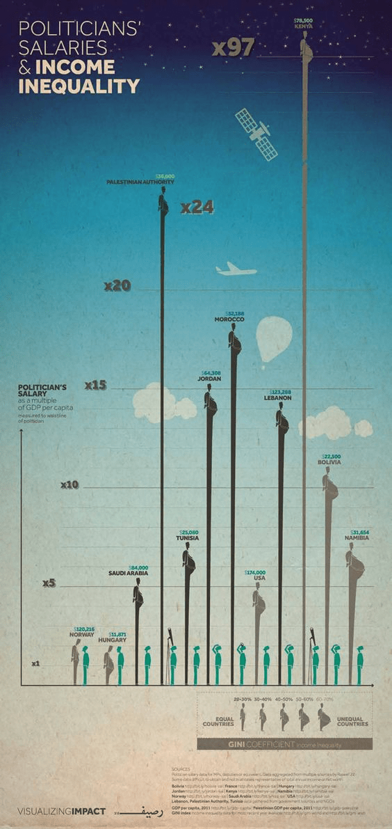
I love this chart because it’s addressing inequality on so many levels. It’s using the physical qualities of the politician in their height and waistline to demonstrate discrepancies of both salary and % of salary in comparison to their countries GDP. It’s effective because it’s demonstrating both internal inequality, as well as, a level of inhumanity when a politician could be earning nearly 70% worth of their country GDP.
All of the data is sourced from government websites which are linked at the bottom of the graph. However, they are also forthright in saying that some of the annual incomes are aggregated from several sources and may not be entirely accurate.
Politician’s Salary Chart, Close Up
They are some elements of color which are very clear – like the citizen is shown in green with the politicians are in gray. They additionally shade the politicians in darker gray if their salary is closer to equally proportionate with their countries’ GDP and lighter gray if it is more unequal. However, those shades take a little bit of time to identify as it’s not immediately clear in the key. I also appreciate that there is a bit of playfulness in the drawing of the citizens. If the politician makes substantially more (and is thus very tall), the citizen is craning their neck up or even looking through a telescope to see them.
The visualization is created by an organization called Visualizing Impact. They are dedicated to creating tools that highlight social issues around the world, in particular, marginalized perspectives on those critical issues. In which case, the intention of this chart is very clear and quite effective. It makes a complex topic, pay inequality across the globe, visible and clear. I feel it is very successful.
