Final Project Proposal

My thesis partners (Mary Beth and Corinne) and I went into the thesis process looking to design something that would increase engagement with environmental policies in government. We have spent the last 8 months interviewing citizens all over the country to understand how this issue is perceived. We interviewed environmental organizations, politicians and policy experts to understand how the system currently works and what areas are prime for intervention.

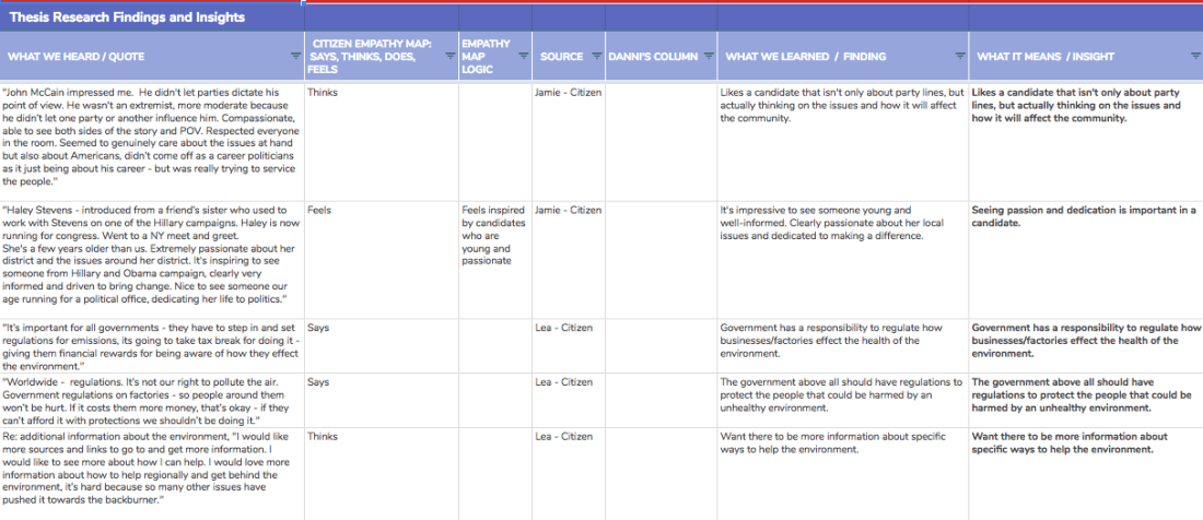
In order to identify our problem/thesis we have conducted over 60 interviews with subject matter experts, politicians and citizens. From those interviews, we have identified and synthesized over 350 insights. The insights have been categorized to understand what barriers currently exist for citizen engagement and what opportunities might exist for us to address.

Screen Shot 2018-11-15 at 1.10.04 PM

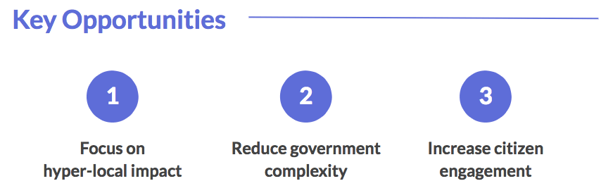
Based on the synthesis of our research we identified 3 key takeaways:

Screen Shot 2018-11-15 at 1.12.44 PM

From there, we refined our problem statement:

There is a lack of citizen engagement around environmental issues due to the complexity of local government.

For this data visualization I am looking to answer the question:

What are the opportunities and barriers that influence a citizen’s engagement with local environmental issues?

That visualization will speak to our thesis statement and our ultimate goal of designing a solution that will:

Enable citizens to partner with their local elected officials to address environmental issues.

My team and I have been looking at the breakdown of barriers and opportunities to engagement for months and it’s very clear in my mind. So, I’m excited to create a visualization that makes this hierarchy as clear to anyone looking at our research as it is to our team.

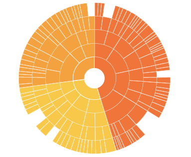
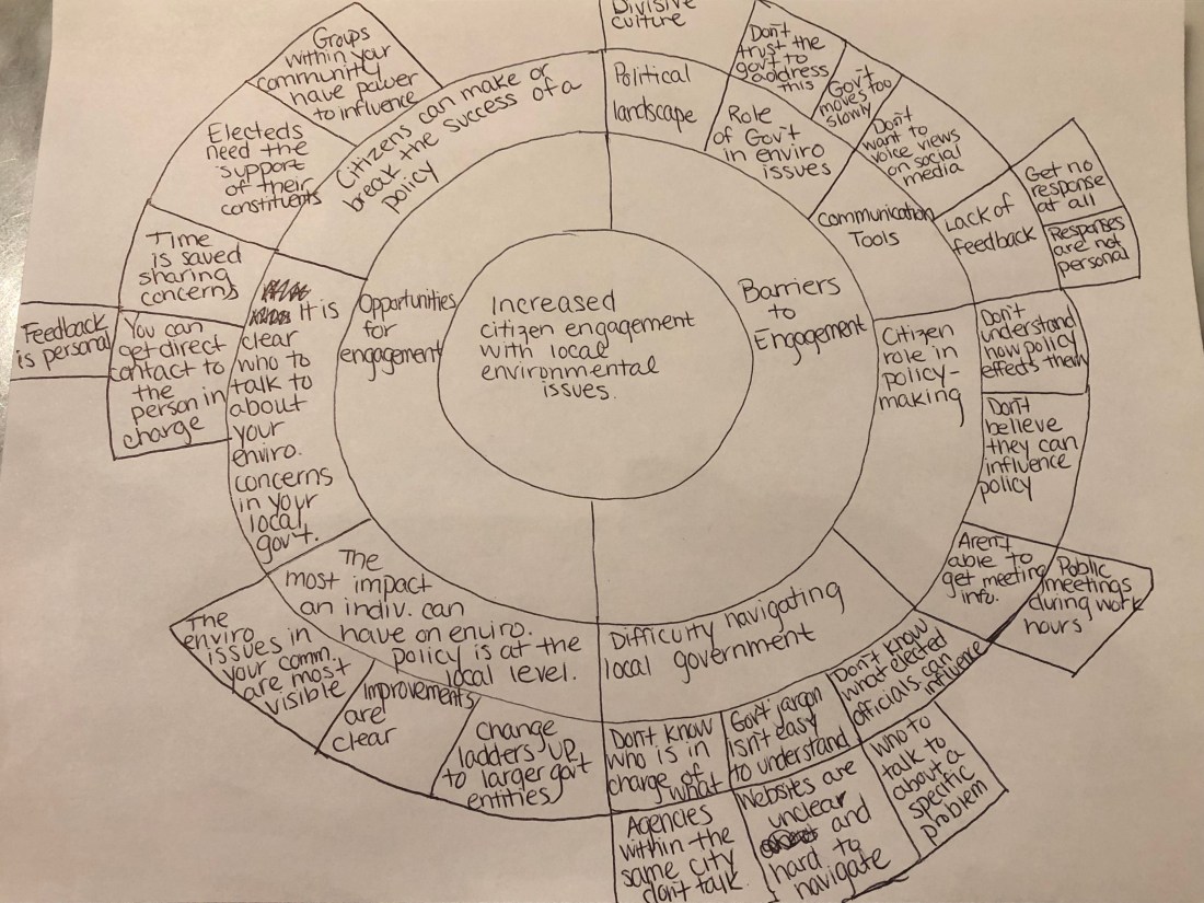
I found the Data Visualization Catalogue  to be particularly helpful for deciding on how to break down our data. I was able to narrow it down to two chart styles and am hoping for some feedback in class to help get clarity on which would be best. The first is the Sunburst Diagram, which is a great way to pack a lot of the Hierarchical Data  we’ve uncovered into one clean image.

I really like this Interactive Sunburst Chart although I think it may be a bit outside my skillset? This Gay Rights by Type version of a sunburst diagram make me even more confident I can tell my story with this style.

Screen Shot 2018-11-15 at 12.52.35 PM

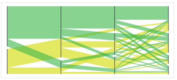
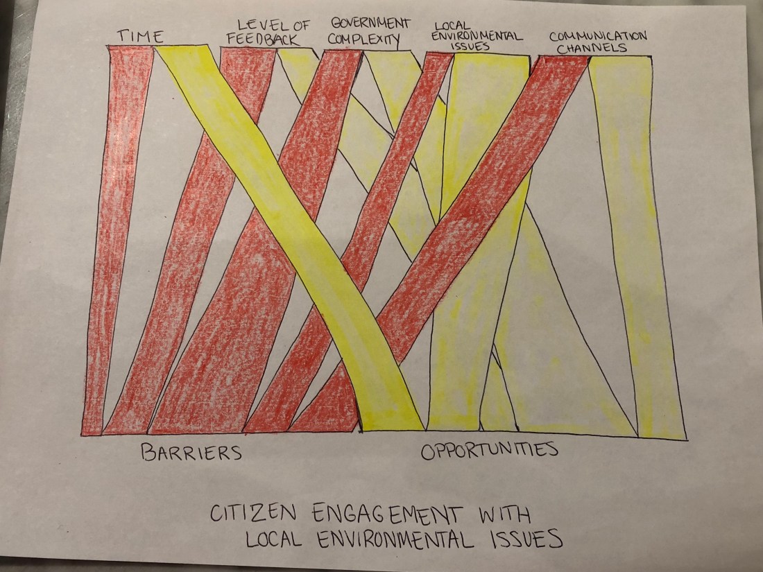
The other style I’m exploring is Parallel sets. I would be able to use the same barrier and opportunity dataset used in the sunburst diagram, but visualize is slightly different.

Screen Shot 2018-11-15 at 1.52.27 PM

Below are some very rough sketches for how I think the data could be visualized in these two styles:

Sketch for Sunburst Diagram:

Sunburst_D.Shepard

Sketch for Parallel Set Chart:

Parallel Sets_D.Shepard

I’m still playing around with the style I want for this project. Part of me wants to do a high-contrast color graph, i.e. black background, with bright colors:

I’m also interested in potentially doing something more handmade:


You can see more of the ideas I’m looking at as inspiration in my Moodboard via Pinterest here.

I’m REALLY excited about this assignment, Thanks Joey 🙂

Let’s try to Build a Webpage

This week we were asked to use the skills we’ve learned to date to build a more traditional webpage. I was excited about getting to take on another assignment where I could tweak existing code an infuse some more personalized elements to it. There were a few pieces that I was successful in building and also quite a few things that I was really stuck on.

These successes include:

  • Changed the font! 🔥
  • Resized text and headers! 🔥
  • Swapped out the original photo of the world map, with another one I liked a bit more! 🔥
  • Added more context around what “life expectancy” means. 🔥
  • Loaded the visualization I had previously made using with data about life expectancy in regards to a person’s home country. 🔥

Places I got stuck:

  • Changing the background color. I tried to change the background to coral, but for some reason, it’s only showing up as a small sliver on the sidebar. I think it might be where it’s located in the order of the code because it seems to appear when it’s loading, but then it only stays visible on the side. 👎
  • The box to see my visualization where you can check the life expectancy in regards to home country is so small. I’m pretty sure this has to do with frame size parameters, but I can’t figure out how to resize it. 👎
  • I was able to change the text link color to hot pink at one point, but I was only able to make work on one link and I’m not sure why! For continuity sake, I just changed them all back to blue. 👎

Here is my not-so-great webpage in all its glory! 🤖

Life Expectancy – Data Change

I had a lot of fun with this assignment. I’m still super uncomfortable with actually creating my own code, but getting to play around with existing code was a blast. I tried out a few different things:

  • Changed the text to be larger – then to be smaller.
  • Changed the text positioning and size.
  • Changed the shapes representing life expectancy from an ellipse to a rectangle.
  • Changed the background color (color is still something I still really have trouble with for some reason).
  • I got really into adding all kinds of emojis to the page. It felt like my upper limit for personalizing this code, so I really went for it‼️

I started looking at all the cool things you could do through the p.js website and I really wish I knew enough to just drag and drop code in. I wanted to try the “snowflake” or “particle system” effect they featured.

I also tried to incorporate a background image, but also couldn’t quite make that happen. More specifically I wanted to use this photo of my Dad:

Frame 2

Overall, this was really fun. 😎

Visualizing CO2 Rise

I had a lot of feelings trying to work through this assignment.

Going into this week’s deliverable I was feeling really good about my general understanding of how coding works. When the semester first started, I didn’t even have a framework for understanding what coding meant, it was all very mysterious. However, I really appreciate that ultimately, it’s just a series of rules and directions and there are, at this level of coding anyway, tangible answers for any roadblocks I may come across (although &&, || threw off my feelings that it all makes total sense.

Thanks to my classmate (Zoe) I was able to export the dataset you shared with us as a .CSV and load it into p5.js. I spent a lot of time watching the videos you shared and trying to practice each little piece as I learned it. For full transparency though, I really struggled with this assignment. I tried to take it piece by piece and correlate the specific takeaway from each video into the assignment, but I got really stuck.

Once I had the data loaded, I knew I had to remove the -99.99 value as it wasn’t meaningful data to include. I was proud that I found the “Find” button under the “Edit” drop-down menu and manually removed each of the -99.99 numbers. However, at that point, I was having trouble with how to actually connect that data with any meaningful output for running code and realized maybe I had messed up the overall dataset by removing -99.99 when maybe there needed to be a placeholder there?

I spent time talking with Mary Beth as she was able to put the pieces together for what code should be included to create a visualization for this assignment. I am now working through that code and connecting it back to the videos to see how it applies for future assignments – so I’m sort of learning it in reverse. I’m hoping more practice with the pieces leading up to what was required for this most recent assignment will help me internalize it better for future application. I do however miss getting to create visualizations with other mediums like we did for the Giorgia Lupi project. Perhaps we can circle back to some of those styles?

Data Visualization & the new Matriarchy

My thesis research is about improving the communication between female political candidates/electeds and environmental issues/policies that their constituents care about.

Simply put, I want to see more women in politics and I want environmental issues to be better addressed by the government.

I think computation can further my research goals in a few ways. The first is to highlight existing data which shows female politicians disproportionately vote in favor of pro-environment policy over their male counterparts. This data will ideally help mobilize voters that identify the environment as one of their top issues.

I would also love to create some new data connecting increased voter turnout with constituents feeling they can easily communicate their concerns to their representatives. And inversely, it would be very meaningful to have data which shows that politicians increase their attention on constituent concerns with these better communication channels.

I don’t have a ton of datasets off hand to pull this information from, but it’s a priority as we move through this next phase of research. We are also now beginning to partner with organizations that focus on training politicians (igniteRun For Something21 in ’21and many more) and plan to get some robust analytics from them.

In regards to my desired knowledge about coding, I would like to understand the verbiage and some foundational concepts. It’s mostly so that I can meaningfully participate in conversations that may require coding in a future professional setting. I don’t, however, expect myself to really commit to a serious coding project in my career. I have so many other skills I think are imminently important for me to practice to support my future success.

Dear Data Mobility Diary

Collect

For one week I tracked my mobility in and around New York. It was important that I vigilantly tracked as I went through the day because there was no

one I would remember where I went or how long it took to travel from place to place. I tend to visit quite a few places throughout the day, so it was surprisingly validating once I saw the data that there actually is a reason I feel tired by the end of the night! All of the data can be found here.

Parse/Filter & Mine

Reviewing the different styles for visualizing data via Pinterest and through the work Georgia Lupi has done, I had expected to feel really overwhelmed and confused about how to represent all of my information. However, when I actually sat down to strategize, I realized that I didn’t need to represent every piece of data (i.e. time of day when travel took place) and could focus on the pieces I found more interesting (time spent traveling and mode of transportation.

Represent & Interact

I then decided on which pieces of information I thought were worth representing, these included:

  • Transportation style (walking – empty square, subway – filled in square and on-demand transportation – triangle).
  • Locations I visited, were represented with circles.
  • Time was then standardized across the board, with each increment representing 5 minutes.

I bunched two columns at a time to represent a day – so reading top to bottom and then left to right. So the first two columns of data = Friday, the next two columns of data = Saturday and so on.

Refine

When all was said and done I, of course, had thoughts about ways I could have done it better or made the information more clear. I realized I probably didn’t even need to distinguish which subway station I was at since the data was really more focused on the mode of transportation and travel time vs. where I actually went.

I genuinely enjoyed this project though. It actually inspired me to use this approach for another year-long project I am working on for my Leadership class. I’m definitely looking forward to doing more of this, particularly because there is freedom in the mediums we use going forward.

Data Viz Critique

I’ve decided to critique the following data visualization, titled “Politicians’ Salary & Income Inequality”.

Politician Pay

I chose this visualization for a few reasons. The first being that I am very interested in the political space and the power/influence politicians hold. I also feel that a country’s culture directly correlates to the politicians that hold power and how they use that. Simply put, countries that tend to have a higher quality of living, with more effective social systems tend to elect leaders that represent those values and are less mired by corruption. My thesis work at DSI is about the disconnect in the political discourse around environmental policy and the concerns everyday citizens feel about those issues. I think lifestyle discrepancy plays a big part in how out of touch politicians can be with the average person’s concerns.

I love this chart because it’s addressing inequality on so many levels. It’s using the physical qualities of the politician in their height and waistline to demonstrate discrepancies of both salary and % of salary in comparison to their countries GDP.  It’s effective because it’s demonstrating both internal inequality, as well as, a level of inhumanity when a politician could be earning nearly 70% worth of their country GDP.

All of the data is sourced from government websites which are linked at the bottom of the graph. However, they are also forthright in saying that some of the annual incomes are aggregated from several sources and may not be entirely accurate.

Politician’s Salary Chart, Close Up

They are some elements of color which are very clear – like the citizen is shown in green with the politicians are in gray. They additionally shade the politicians in darker gray if their salary is closer to equally proportionate with their countries’ GDP and lighter gray if it is more unequal. However, those shades take a little bit of time to identify as it’s not immediately clear in the key. I also appreciate that there is a bit of playfulness in the drawing of the citizens. If the politician makes substantially more (and is thus very tall), the citizen is craning their neck up or even looking through a telescope to see them.

The visualization is created by an organization called Visualizing Impact. They are dedicated to creating tools that highlight social issues around the world, in particular, marginalized perspectives on those critical issues. In which case, the intention of this chart is very clear and quite effective. It makes a complex topic, pay inequality across the globe, visible and clear. I feel it is very successful.